What is a pictogram? It’s a graphical symbol that conveys information by depicting a physical object.
You see them everyday and they are so familiar to you you don’t even notice them: on road signs, on a remote control, on your smartphone, on your computer keyboard or desktop. Emojis are also a kind of pictogram.
When you simply write a note with an arrow pointing to something else, you are employing a pictogram. You’re saying: "An arrow going in this direction would meet this object."
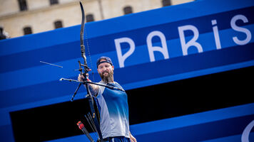
Pictograms are also a long-established part of Olympic communication, where the organisers have to communicate to people who speak many different languages. You might not speak French – or indeed English – but because of a little symbolic image of a sport and an arrow symbol you still know that the swimming is this way out of the subway station or this ticket is for badminton at 3pm.
More importantly, it simply helps reassure you you’re going the right way or you’ve got the right ticket.
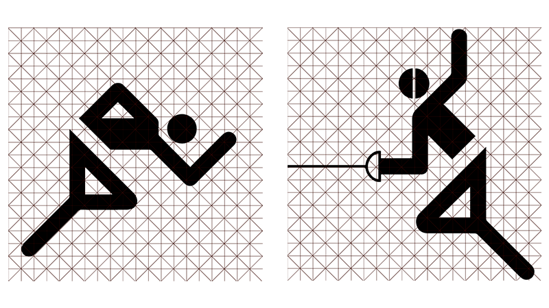
Pictograms in an Olympic context were first used in 1964, but by far the most famous and influential set was made by German designer Otl Aicher in 1972 for the Munich 1972 Olympic Games. It was reused again four years later in Montreal.
Aicher used a standard set of design elements for heads, arms and legs – and in doing so, created the world’s first modern design system.
The vast majority of Olympic pictograms since have been based in some way on his work, and many other forms of signage too. It’s not an exaggeration to say that Aicher literally changed the way we see the world.
Olympic pictograms usually try to capture the essential postures of the human body that are emblematic of each sport, and sometimes the competition ground too. They should be instantly understandable, and work when printed at small sizes as well.
Archery is perhaps one of the easier sports to capture in a pictogram, because everyone knows what it looks like. (It’s a lot more difficult to squeeze in all five sports in the modern pentathlon).
However, at Paris 2024, they’ve done something a little different.
First, let’s look at some archery pictograms from Olympic history:
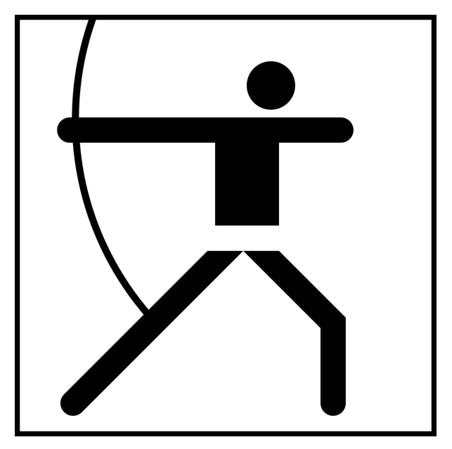
Munich 1972
In 1972, the archery competition was reintroduced after a 52-year absence. The pictograms designed by Otl Aicher for the Munich 1972 Olympic Games were re-used four years later at the Montreal 1976 Games, and the full set is considered a design classic, endlessly copied and influential on all designs that came after.
The head is at a strange angle, and the legs aren’t doing quite what a real archer would do. But somehow it gives the impression of full draw, effort and movement.
It captures something of the tension of archery – which is actually pretty remarkable considering it consists of little but circles, lines and boxes.

Moscow 1980
Design student Nikolai Belkov won the competition held amongst students at Moscow art colleges to design the full set for the Moscow 1980 Olympic Games, basing his work on Aicher but smoothing the corners and adding character.
The archer has a big, powerful stance, and his rear elbow is a more realistic angle.
This one is closer to the ‘real thing’ and adds a little energy too. It works really well.
Barcelona 1992
The design for Barcelona 1992 was more radical. They decided to discard the geometric formula in favour of the work of an artist called Josep M. Trias. He used a simplified representation of the human body, dividing it into three parts: head, arms, and legs, but using a broad brush stroke.
It almost moves, like someone dancing while drawing a bow.
Athens 2004
The Athens 2004 pictograms drew inspiration from ancient Greek civilisation. The representation of the archer is influenced by Cycladic figurines, while the artistic style is inspired by black-figure vases. In these vases, the human body is depicted with solid black shapes, and a single line is used for detailing.
Do you think it worked? Perhaps our archer this year lacked a little energy.
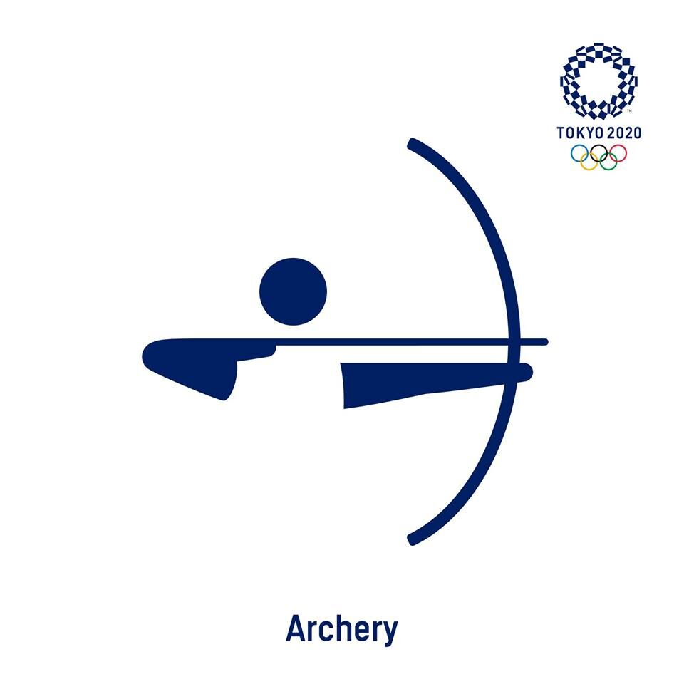
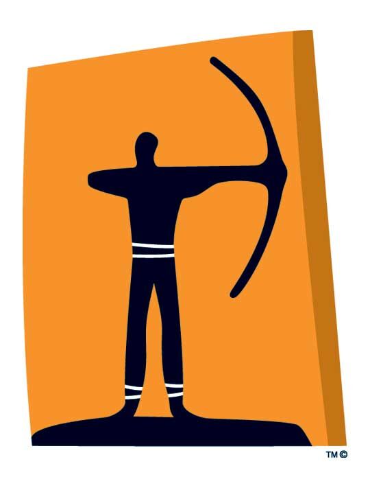
Tokyo 2020
The Tokyo 2020 pictograms were created by a team led by Japanese designer Masaaki Hiromura, and the bare-bones archery one was one of the strongest of the set.
The draw with the anchor point ‘below’ the head just might be giving a nod to kyudo, the traditional Japanese archery martial art.
The traditional feel extends to the simple arc shape of the bow – although a kyudo bow is asymmetrical. It’s kind of a hybrid design, taking the basic body part building blocks and adding a little of grace and movement.
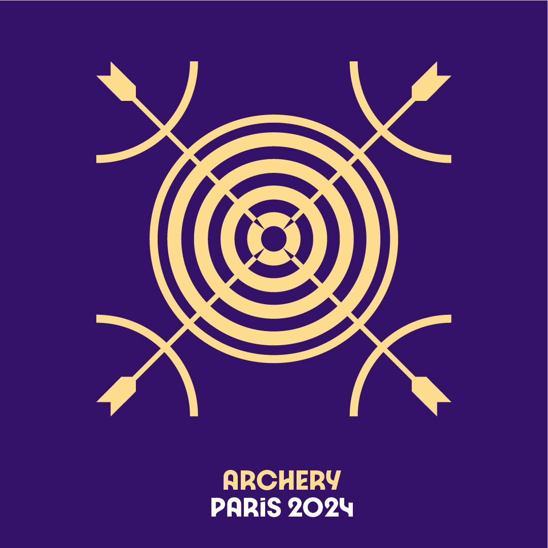
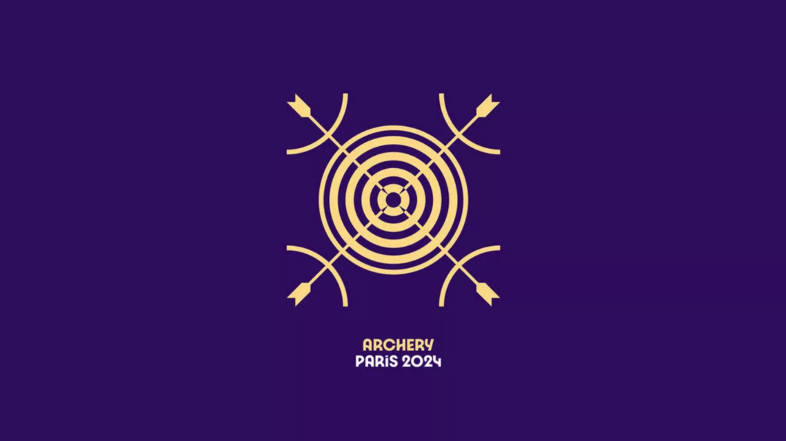
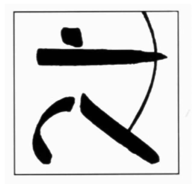
Paris 2024
The design team in Paris have made some changes. Unlike the vast majority of pictograms in Olympic history, there is no representation of the athletes.
Rather, each pictogram is composed of three graphical elements: “an axis of symmetry; a depiction of the ground; and a representation of the sport that it illustrates.”
The Paris 2024 president described them like this: “Not so much a pictogram as a blazon, a coat of arms, so that we can all be proud of the sports we are hosting.”
It’s a definite break in tradition. Let’s see what this looks like for archery:
So we have a specific tool related to the corresponding sport (a bow and arrow), a representation of the ‘playing field’ (a target face – although not an official one!) and an axis of symmetry to give it a ‘coat of arms’ appearance. These elements are put together to make up the official emblem of the sport.
The new designs are maybe not so traditional, but they are taking it in a new direction. Perhaps they work better for some sports and not so well in others.
Unlike for the last few Games, there is no separate pictogram for Paralympic archery – it’s going to use exactly the same design.
One thing is for sure - pictograms are not going anywhere and they will be a part of Olympic design for many Games to come. Even if in a digital world they don’t seem so important, they are part of the design language of the Olympics, and that is often something you ‘feel’ more than think about.
It’s sometimes overlooked – but when people see the pictogram for archery on a TV screen, in a programme, on a ticket or somewhere else, it’s absolutely a part of the Olympic sport and what it means.